I was thinking I'd hang the gold mirror above the nightstand so I was inclined to change the color of the trim. Originally, I thought I'd paint it navy. I had a heck of a time finding the right shade of navy, then I ran across this color (Gentlemen's Gray) at Benjamin Moore and loved it. It totally ties in the color of my pillows. But now that I see it directly up against the mirror...I just can't decide if it's right!

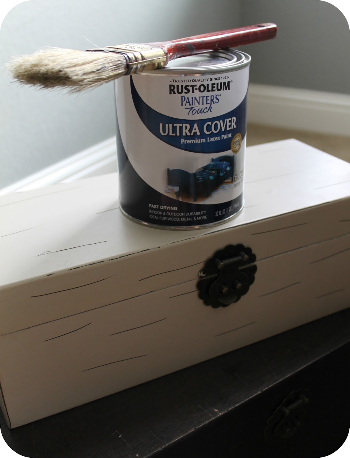
Here's where I started...
BEFORE

And here it is now...
AFTER

I think what is throwing me is the square corner pieces. It looks too heavy. Or is it the color? Aaaggghhh! Why can't I figure this one out?
I've thought about possibly adding a gold glaze over the blue to soften the look. I have no idea if that would work or not!
Or do I like it?! Sometimes it just takes a little time to get used to seeing something in a new light. I'm planning on leaving it until I finish the giant art piece I'm painting which will hang directly adjacent to it. Also, I'd like a new lamp...is that what throws this whole little vignette off-balance? It's not styled currently, but I don't plan to add too much more since I'm not a clutter person. (Sorry, you're reading my internal thought process!)
To prove to myself that this wasn't a completely hair-brained idea, I went searching for similar pieces. Most people do this first, because that would've been the logical thing, right?
This is the only piece I found...

Here's the shot I posted Monday to give you an idea of the full view...

Okay, friends, please don't hold back on sharing your thoughts and opinions...
Do I...
keep it?
return to the original color?
go after another color?
add a gold glaze?
paint those silly square corner pieces something different?
stop stressing over something so insignificant? :)
Surprise me with your brilliant ideas!
Linking to: Primitive & Proper