

That being said, these first ones still embrace modern aesthetics...huge windows, great views, bringing the outside in and no clutter.

Can you imagine waking up to this every morning? Here's my question...it's often well over 100 degrees here in Texas, does this begin to feel like you're living in an oven during summer?

Okay, read this close! This high-end, more then likely million dollar house, used Ikea cabinets in their kitchen. Yep, these white drawers are from Ikea. How about that? Perfect example of mixing high-end and low-end to create a killer look. Granted, he used 4 sets of the cabinets and the opposite side has an amazing custom wood shelving unit that ties it all together perfectly, but hey, Ikea's still involved. ha! And, you're probably wondering why I don't have a picture of the custom wood shelving unit. Yeah, I'm wondering that too.

Beautiful mixture of acacia wood and cement.
Now, for the more contemporary feel...

Super cool lamp and great abstract art.

This is only one of the amazing outdoor spaces this house had to enjoy. Are you loving the steel framed windows as much as I am?

If memory serves me right, this family had 5 boys! Here's their playroom and below is one of their bathrooms. Each boys' room/bathroom was exactly the same but different color schemes.

Clean and crisp.

If I could have pulled this off the wall and snuck it out in my purse I would've!

Great chandelier and more beautiful windows.

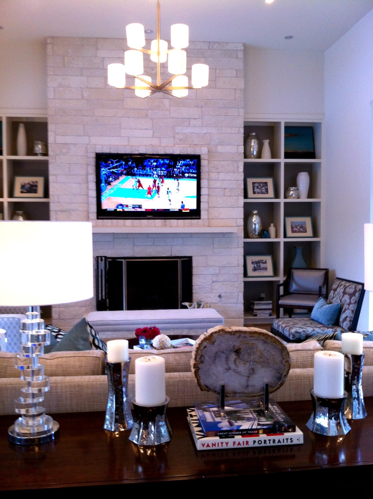
Loving all the mixture of patterns going on in this picture.
Beautiful styling.
The next 2 pictures turned out really blurry, but this sink was too cool not to share.

It's difficult to see, but if you look close you'll notice the wall mount hardware.

Think this is a master bedroom? Nope, it's the guest suite. It was detached from the rest of the house, connected by a covered walkway and had a view of the gorgeous pool. I'd be a guest in this house any day!
Back to modern...

I pretty much love this shelving unit that acts as a room divider. The brown doors are push open doors to add a bit more storage.

Crazy cool wall. Lots of cement in these houses.

And, sadly, this is the only exterior shot I took. The above two pictures belong to this one.
Well, I hope you enjoyed the tour. Even if it's not your style, it's always great to appreciate the workmanship of others.


4 comments:
yes, i definitely like this one more! love the blue and orange bedroom, the living room with built ins next to the fireplace and love the "love". :) oh and that outdoor space- awesome!
I love that vignette with the abstract and the bathroom, please! Thanks for the fun tour!
How did I miss this! I am a fellow Austinite and self-proclaimed minimalist. I love these homes and only wish I could have seen it in real life. Thanks so much for sharing!
That very first picture is TO.DIE.FOR!! I'd gladly stay in that guest suite as well. So awesome!
Post a Comment